 RSS Feed
As an engineer I am not always on the same wavelength as the end user. What I feel is interesting and innovative might induce reluctance, panic, or hunger in the user. Our jobs depend on catering to these puzzling beings, whose rationale we may never understand. Fortunately, we can observe them in their natural habitat and adjust accordingly. Altering the users’ environment and seeing how they react helps us to create a better environment for them. This does not tell us ‘why’ they like this more than that, but I doubt the users themselves can answer that question.
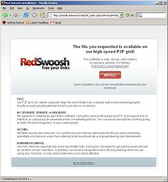
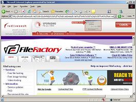 The investigation into the users’ collective mind began with the release of our new installation page, or ‘the bar’ as we like to call it. For those of you who are not familiar with Red Swoosh, our installation page is where users are sent if they click on a swooshed link but do not have the Red Swoosh client installed. Man, that bar looks good (left). And, it kept the referring customer’s page in a frame below it preserving context for the user. It was going to send installation figures through the roof. On the contrary, after its release, we noticed that installation rates dropped significantly. Was the bar broken? No, for reasons we could only guess at, the users did not like it as much as our old full page installation screen.
 Our model changed. Rather than trying to give the users what we thought they wanted we decided to give them what they actually preferred. Randomly sending a subset of the potential swoosh users to various installation pages gave us invaluable information. How much better is a full page installation screen than a frame based one at converting users? Does the inclusion of a referring customer’s logo matter?
Over three iterations we removed poorly performing installation pages and replaced them with variations of the ones with high conversion rates. Here are a couple of fun facts we have discovered.
- Quickly whipped up variations of the full page installation screen convert at 10%-15%, where as the variations of the bar did not exceed 5%.
- Including the referring customer’s logo, making the installation page look really nice, changing the wording, hardly affect the conversion rates.
Our Darwinian approach to installation page selection is only in its infancy, but the results are already noticeable. Hopefully we can reach an understanding of the users to clearly convey the good will of Swoosh, and even conquer their habit of clicking ‘back’ or closing the installation page.
-w
This entry was posted on July 3, 2006 at 6:58 pm and is filed under General. You can follow any responses to this entry through the RSS 2.0 feed. You can leave a response, or trackback from your own site.